The personal site of Cvet Georgiev

Category: Economics

Why the Bank of Canada would not lower interest rates amidst the corona virus outbreak?

I would like to preface this post with the statement that I have no special information about the Bank of Canada’s decision on interest rates tomorrow – March 4, 2020. However, as a keen observer of monetary policy, I have to disagree with the market expectation of the bank decreasing the interest rate. There are a few reasons why I disagree.

The problem with COVID-19 is that it is a supply-side shock unfortunately, the bank doesn’t have a lot of tools to deal with supply shocks.

But why is a supply-side shock a problem for the bank? Let’s look at an example of a supply-demand relationship.

Supply side shocks and monetary policy outcomes

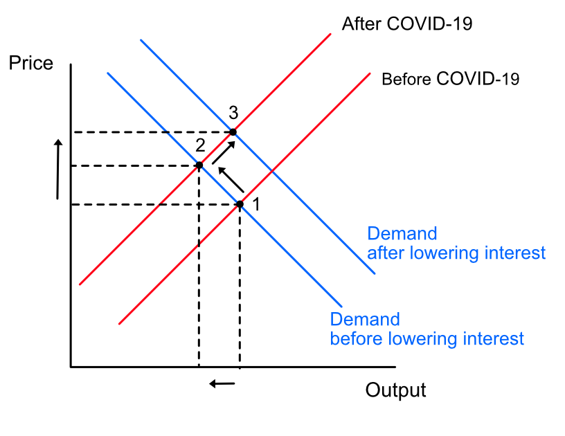
In a supply shock, we have the supply curve moving up and to the left (from 1 to 2) leading to higher prices (higher inflation) and lower output. Now think about what happens if the bank lowers rates. Rates are lower so borrowing is easier for both consumption and investment. As a result demand increases. In our graph world, the demand curve moves to the right (from 2 to 3). But observe what happens to prices. They go even higher. This is counter to the bank’s focus on low and stable inflation.

Besides, lower interest rates means lower mortgage rates. The bank has been, for a few years, worried about the stability of the financial system because of high personal debt due to increase borrowing in certain segments of the housing market.

If you observe inflation rates, a key target for the bank, there is no hint at this time that rates are increasing. Obviously, they will go up due to the supply shocks from the virus but those will be temporary until supply improves. Impacts are still going to be felt in the future. Even if the bank acts at this time, we know that monetary policy has a lag. So the full effects would be felt in 6-8 quarters. By that time, it is unknown if COVID-19 will still be active.

If the bank acts now this puts us closer to the lower zero bound. If a real demand shock is going to occur in the near future, it will limit the bank’s effectiveness and ability to deal with it. There are a few more reasons I can think of why the bank would not want to lower rates now. I leave it to you to discover on your own. (hint: what happens to GDP when consumption and imports decline?)

Of course, this is just a prediction and I could be completely wrong. I have been surprised by the bank’s actions in the past. We will find out in a few hours.

Update (2020-03-04): The bank lowered interest rates this morning by 0.5% to 1.25% due to a weaker outlook as compared to January. The bank prefaced this by saying that it stands ready to “support economic growth and keep inflation on target”. I find this statement a bit unusual for the bank because the bank’s primary focus is on inflation (see the Bank’s monetary policy objectives). By including supporting economic growth in-front of focus on inflation does the bank try to signal a change in attitude away from inflation and towards a dual mandate like the Federal Reserve in the US or is this statement meant to reassure business sector confidence?

Does the market know that a recession is coming?

I thought it would be an interesting experiment to see how the market has performed on the cusp of past recessions. Does the market know that a recession is about to happen? Does it behave differently just before a recession? Are there any early indicators of a recession we can deduce?

Lately, there has been a lot of talk about an upcoming US recession, in both the popular media as well as the blogosphere (e.g. see here or here). One major contributor to the rhetoric is the recent inversion between the short and long end of the yield curve. Yield curve inversion has been discussed as a reliable indicator of an upcoming recession.

The experiment

To visually see how the market has moved on a cusp of each recession, I plot the S&P 500 index returns over previous cycles just before a recession. This is not a statistical analysis, but I am curious to see if there any patterns that warrant further statistical study.

What does the data say?

Interestingly enough the data says what I expected it to say. The market has no idea it is about to go into a recession. Looking at the plots of the last 10 recessions, you see that the market is all over the place just before a recession (recession starts at t=0 or the rightmost part of the graph).

Figure 1

In some years the market is up about 15% up before a recession hits, notably 1981. In others, it is down 10% like in 1969 and 2001 (See Figure 1). There seem to be no discernable patterns you can use to gauge when a recession is coming even from a real-time indicator like the stock market.

Figure 2

Why is the yield curve used as an indicator of a recession?

The reasons given vary but it usually has to do with the normal operation of the financial sector. The main function of most banks is to provide loans to the private sector by borrowing money long-term and lending them short-term while charging a premium. With the inversion of the yield curve, the normal function of the financial sector is being disturbed as banks cannot borrow long-term and lend short since they would have to pay a premium. If this goes for long enough, a recession could originate from the financial sector.

Where does the data come from?

I use the NBER business cycle dating committee as the source of recession start and end dates. Data for “the market” is taken from Yahoo Finance. I use the S&P 500 index as an indicator of the market. It is large enough and covers broad sectors of the US economy that it should more or less represent the general market sentiment. There are better ways to get at the overall market (e.g. combining other US indices – Russell 2000, NASDAQ and Dow Jones) using Principal Component Analysis to get at the common movements across all US markets. For this simple exercise, using the S&P 500 will do the trick.

Recession timing in Canada

While digging through recession data for Canada I stumbled on this tip-bit: if you sort the number of days between recession dates in ascending order you will find the following quadratic function.

The longest number of days between recessions was 6027 days ( ~16.5 years) while the shortest was 365 days or just 1 year.

On average Canada experiences a recession every 2315 days or 6 years and 4 months (estimated using a non-parametric regression). The last recession ended exactly 3416 days ago. Enough said.

What explains productivity growth in Ontario?

Last year, I wrote and presented a paper at the Canadian Transportation Research Forum that expanded the official productivity statistics for Ontario from 1997 back to 1985.

The method I developed increased the sample size of productivity statistics for Ontario by an additional 12 years (essentially doubling the sample). The surprising result is that productivity slowdowns, such as the one we have been experiencing recently, are the norm according to the history of productivity statistics. Looking back to the period 1985 to 1993, I see a significant stagnation in the growth rate of productivity, similar in magnitude to the decline since 2008. It is the nature of productivity growth to be unpredictable. Therefore, it is highly likely that the recent productivity slump does not represent a profound shift in the underlying dynamics of the discovery of new ideas or human technological progress.

If you would like to read the full paper, you can download it from here: Canadian Transportation Research Forum

Figure 1: Index of Ontario’s Productivity growth between 1985 and 2010. Ontario's productivity index

Where does it pay to live in Ontario?

Recently, I have been looking through some wage data, and I found one fascinating fact about the difference in wage rates between different skill categories (from skilled to unskilled).  In Ontario, the difference in wage rates (weighted by the available jobs) between large metropolitan cities (Toronto) and smaller towns (Windsor-Sarnia, Ontario) is minimal for the most unskilled jobs. There is a premium for working in large metropolitan cities for most jobs, but the % difference is quite small (less than 5%).  In smaller towns, there exists a significant disincentive for skilled labour to attend to. In this example, Windsor-Sarnia has a 12% lower wage rates for similar work in other places in Ontario.

Why is this important? It pays for low skilled labour to live in smaller cities in Ontario as the difference in wages would be non-existent while the cost of housing is much lower. Paying less rent while receiving almost identical income as compared to a big city like Toronto is quite the incentive.

The opposite is true for skilled labour. The premium is not as much as I would have expected given the magnitude of Toronto economic region (ER) compared to the next closest economic region (Toronto ER is about five times bigger than the next closest one Kitchener-Waterloo-Barrie).

Here is the summary table of the finding:

Wage difference (%) from Ontario’s average
Skill level Toronto Windsor-Sarnia
Skilled (A) 3% -12%
Less skilled (B) 5% -4%
Almost unskilled (C) 0% 0%
Unskilled (D) 3% 0%

Actual wage rates see below:

Average wage rates (weighted by the # of available jobs)
Skill level Ontario (average) Toronto Windsor-Sarnia
Skill levels A  $  32.79  $  33.77  $ 28.69
Skill levels B  $  19.72  $  20.63  $ 18.94
Skill levels C  $  14.51  $  14.46  $14.50
Skill levels D  $  12.37  $  12.74  $12.33
All skill levels  $19.07  $20.77  $16.74

Source: Statistics Canada. Table 285-0003 – Job Vacancy and Wage Survey (JVWS), Q2-2016.

Notes:

(1) Toronto defined as Toronto Economic Region by Statistics Canada in the Economic Regions – Variant of SGC 2011.

(2) Windsor-Sarnia defined as Windsor-Sarnia Economic Region in the Economic Regions – Variant of SGC 2011.

(3) All occupations within a skill category have been weighted by the number of job vacancies to account for the difference in demand and supply conditions in each occupation type.