Incredibly deep -- Inspiration through thought.

The personal site of Cvet Georgiev

Open Sourcing Ontario COVID-19 Data

Ontario Ministry of Health has been publishing COVID-19 data for Ontario every day on their website. As far as I know, they have not made it available in a time series format for those of you who like to see the full data since the pandemic began in Ontario. I have been collecting this data and have decided to open source it on my github page. I will continue to collect and publish this data, daily, for those that might find it useful.

Some preliminary findings for Ontario

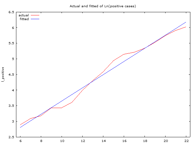
Unfortunately, preliminary findings show that Ontario is still on the exponential growth path. The straight line in the following graph shows an exponential fit to the data (R-square = 0.98).

Model of best fit for Ontario showing exponential growth of cases (point 22 is March 22, 2020)

But there is hope. In the last two days, the red line has been shifting from the trend. This could be a break in the exponential growth path (social distancing working) or statistical anomaly. Only time will tell.

Current best model fit for the number of Ontario cases is: $$Number\:of\:positive \: cases= e^{1.54+0.21*Days_{since \: Feb\: 29,\:2020}}$$

Comparison to the Chinese experience

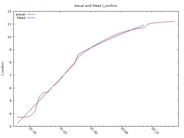
Looking at the Chinese data there is a break in the trend around January 26, 2020. A statistical model of the Chinese data shows this clearly.

Ontario is still below the point at which the Chinese managed to curb the growth rate of the virus. We are about 11 days away from that event. In our favour is the fact that we are on a less steep path. So we have a bit more time to act and restrain the spread. But we need to do it fast. There is still time to take more action. From what I am observing most of us are doing just that. Bravo but let’s keep this social distancing going.

Why the Bank of Canada would not lower interest rates amidst the corona virus outbreak?

I would like to preface this post with the statement that I have no special information about the Bank of Canada’s decision on interest rates tomorrow – March 4, 2020. However, as a keen observer of monetary policy, I have to disagree with the market expectation of the bank decreasing the interest rate. There are a few reasons why I disagree.

The problem with COVID-19 is that it is a supply-side shock unfortunately, the bank doesn’t have a lot of tools to deal with supply shocks.

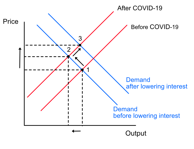
But why is a supply-side shock a problem for the bank? Let’s look at an example of a supply-demand relationship.

Supply side shocks and monetary policy outcomes

In a supply shock, we have the supply curve moving up and to the left (from 1 to 2) leading to higher prices (higher inflation) and lower output. Now think about what happens if the bank lowers rates. Rates are lower so borrowing is easier for both consumption and investment. As a result demand increases. In our graph world, the demand curve moves to the right (from 2 to 3). But observe what happens to prices. They go even higher. This is counter to the bank’s focus on low and stable inflation.

Besides, lower interest rates means lower mortgage rates. The bank has been, for a few years, worried about the stability of the financial system because of high personal debt due to increase borrowing in certain segments of the housing market.

If you observe inflation rates, a key target for the bank, there is no hint at this time that rates are increasing. Obviously, they will go up due to the supply shocks from the virus but those will be temporary until supply improves. Impacts are still going to be felt in the future. Even if the bank acts at this time, we know that monetary policy has a lag. So the full effects would be felt in 6-8 quarters. By that time, it is unknown if COVID-19 will still be active.

If the bank acts now this puts us closer to the lower zero bound. If a real demand shock is going to occur in the near future, it will limit the bank’s effectiveness and ability to deal with it. There are a few more reasons I can think of why the bank would not want to lower rates now. I leave it to you to discover on your own. (hint: what happens to GDP when consumption and imports decline?)

Of course, this is just a prediction and I could be completely wrong. I have been surprised by the bank’s actions in the past. We will find out in a few hours.

Update (2020-03-04): The bank lowered interest rates this morning by 0.5% to 1.25% due to a weaker outlook as compared to January. The bank prefaced this by saying that it stands ready to “support economic growth and keep inflation on target”. I find this statement a bit unusual for the bank because the bank’s primary focus is on inflation (see the Bank’s monetary policy objectives). By including supporting economic growth in-front of focus on inflation does the bank try to signal a change in attitude away from inflation and towards a dual mandate like the Federal Reserve in the US or is this statement meant to reassure business sector confidence?

Does the market know that a recession is coming?

I thought it would be an interesting experiment to see how the market has performed on the cusp of past recessions. Does the market know that a recession is about to happen? Does it behave differently just before a recession? Are there any early indicators of a recession we can deduce?

Lately, there has been a lot of talk about an upcoming US recession, in both the popular media as well as the blogosphere (e.g. see here or here). One major contributor to the rhetoric is the recent inversion between the short and long end of the yield curve. Yield curve inversion has been discussed as a reliable indicator of an upcoming recession.

The experiment

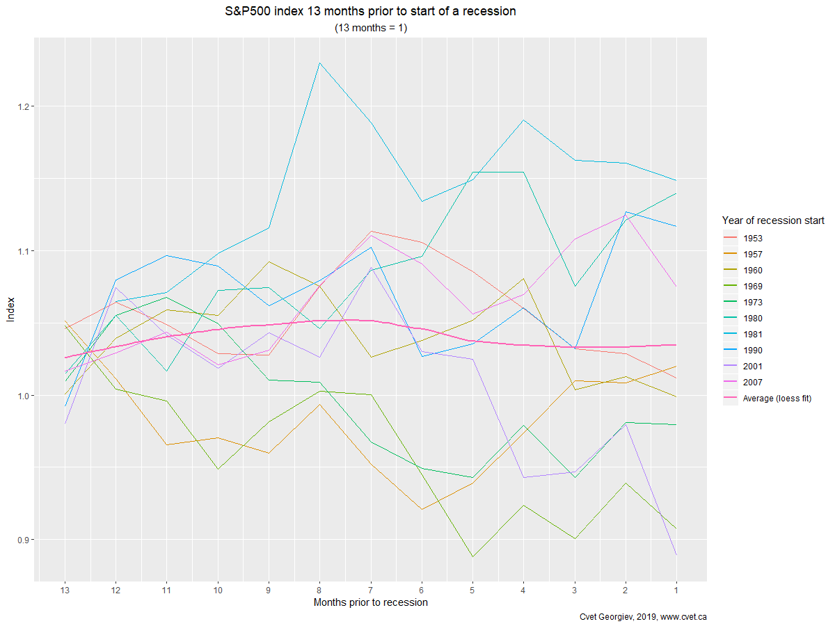
To visually see how the market has moved on a cusp of each recession, I plot the S&P 500 index returns over previous cycles just before a recession. This is not a statistical analysis, but I am curious to see if there any patterns that warrant further statistical study.

What does the data say?

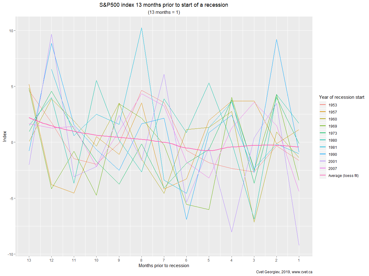
Interestingly enough the data says what I expected it to say. The market has no idea it is about to go into a recession. Looking at the plots of the last 10 recessions, you see that the market is all over the place just before a recession (recession starts at t=0 or the rightmost part of the graph).

Figure 1

In some years the market is up about 15% up before a recession hits, notably 1981. In others, it is down 10% like in 1969 and 2001 (See Figure 1). There seem to be no discernable patterns you can use to gauge when a recession is coming even from a real-time indicator like the stock market.

Figure 2

Why is the yield curve used as an indicator of a recession?

The reasons given vary but it usually has to do with the normal operation of the financial sector. The main function of most banks is to provide loans to the private sector by borrowing money long-term and lending them short-term while charging a premium. With the inversion of the yield curve, the normal function of the financial sector is being disturbed as banks cannot borrow long-term and lend short since they would have to pay a premium. If this goes for long enough, a recession could originate from the financial sector.

Where does the data come from?

I use the NBER business cycle dating committee as the source of recession start and end dates. Data for “the market” is taken from Yahoo Finance. I use the S&P 500 index as an indicator of the market. It is large enough and covers broad sectors of the US economy that it should more or less represent the general market sentiment. There are better ways to get at the overall market (e.g. combining other US indices – Russell 2000, NASDAQ and Dow Jones) using Principal Component Analysis to get at the common movements across all US markets. For this simple exercise, using the S&P 500 will do the trick.

When is the best time to trade stocks?

If you have studied finance or are listening to the news around the end of the year, the one thing you usually hear about is the January effect in the stock markets. The January effect is the hypothesis that socks increase much more in January than any other month.

Why? One theory is that prices go up because of year-end selling. To defer taxable capital gains to future years, by realizing capital losses in the current year, security holders will sell before the end of the year and then re-buy securities in January. Thus increasing the demand for securities in that month. In practice however, this theory doesn’t hold much mustard because tax rules like the 30-day rule (see the section on the superficial losses discussion here).

Is there such thing as a month effect in the stock market?

If I am writing this blog you probably guessed it that there is such a thing. But it is not the January effect but rather a December effect.

Lets look at the data

I took the last 30 years (1987-2017) of data for the four (4) majour US stock indices (each representing different slices of the stock market):

  • S&P 500 (large-cap stocks)
  • Russell 2000 (small-cap stocks)
  • NASDAQ (mainly technology stocks)
  • Dow Jones (mainly industrial stocks)

I clean up the data and test the statistical significance of the returns in each month and compare them to the distribution of average returns over the preceding 30 years. Because I want to look at what investors get paid for holding risky assets, I use excess return to measure performance. Excess returns are the market return minus the rate paid to hold riskless assets (known as the risk-free rate). For the risk-free rate I used the 3-month Treasury Bill rate.

Results

Based on the results presented in the table below,  I see significantly positive returns in the month of December.  December sees on average about 2% growth in the market as compared to any other month, after accounting for variability of across time. In fact, over the past 30 years, only 6 Decembers have seen a decline in the SP500 index.

Interestingly the Dow seems to be additionally have a pronounced April effect.  I wonder what that could be?

Critique on the t-statistic

For those interested, in the table below I present the statistical results (t-statistic) for all months with significant excess return.  Recent research on the topic of statistical significance in the field of finance has come to the conclusion that t-stats might not be a powerful enough indicator of the significance of the finding. As such, I have published an additional indicator as suggested by  Harvey, Liu, Zhu (2015).  This is a more stringent criterion of significance designed to combat data-mining bias. Harvey et al. suggest using t-statistic bigger than 3.0 as an indicator of significance. Currently most researchers use 2.0. Even with this more stringent criteria December does stand out as a month with significantly positive market returns. Even the Dow April effect passes this more stringent test.

Results for each market are presented in the following tables:

MarketMonth with significant returnProbability of monthly
return >0
T-stat above 3?
(t-stat in brackets)
SP500April98.34%No (2.23)
SP500December99.74%Yes (3.01)
Dow JonesApril99.81%Yes (3.14)
Dow JonesJuly 98.19%No (2.19)
Dow JonesDecember99.80%Yes (3.11)
NASDAQDecember97.55%No (2.05)
Russell 2000December99.99%Yes (4.47)

Recession timing in Canada

While digging through recession data for Canada I stumbled on this tip-bit: if you sort the number of days between recession dates in ascending order you will find the following quadratic function.

The longest number of days between recessions was 6027 days ( ~16.5 years) while the shortest was 365 days or just 1 year.

On average Canada experiences a recession every 2315 days or 6 years and 4 months (estimated using a non-parametric regression). The last recession ended exactly 3416 days ago. Enough said.

What explains productivity growth in Ontario?

Last year, I wrote and presented a paper at the Canadian Transportation Research Forum that expanded the official productivity statistics for Ontario from 1997 back to 1985.

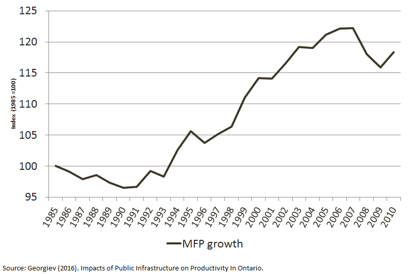
The method I developed increased the sample size of productivity statistics for Ontario by an additional 12 years (essentially doubling the sample). The surprising result is that productivity slowdowns, such as the one we have been experiencing recently, are the norm according to the history of productivity statistics. Looking back to the period 1985 to 1993, I see a significant stagnation in the growth rate of productivity, similar in magnitude to the decline since 2008. It is the nature of productivity growth to be unpredictable. Therefore, it is highly likely that the recent productivity slump does not represent a profound shift in the underlying dynamics of the discovery of new ideas or human technological progress.

If you would like to read the full paper, you can download it from here: Canadian Transportation Research Forum

Figure 1: Index of Ontario’s Productivity growth between 1985 and 2010. Ontario's productivity index

Where does it pay to live in Ontario?

Recently, I have been looking through some wage data, and I found one fascinating fact about the difference in wage rates between different skill categories (from skilled to unskilled).  In Ontario, the difference in wage rates (weighted by the available jobs) between large metropolitan cities (Toronto) and smaller towns (Windsor-Sarnia, Ontario) is minimal for the most unskilled jobs. There is a premium for working in large metropolitan cities for most jobs, but the % difference is quite small (less than 5%).  In smaller towns, there exists a significant disincentive for skilled labour to attend to. In this example, Windsor-Sarnia has a 12% lower wage rates for similar work in other places in Ontario.

Why is this important? It pays for low skilled labour to live in smaller cities in Ontario as the difference in wages would be non-existent while the cost of housing is much lower. Paying less rent while receiving almost identical income as compared to a big city like Toronto is quite the incentive.

The opposite is true for skilled labour. The premium is not as much as I would have expected given the magnitude of Toronto economic region (ER) compared to the next closest economic region (Toronto ER is about five times bigger than the next closest one Kitchener-Waterloo-Barrie).

Here is the summary table of the finding:

Wage difference (%) from Ontario’s average
Skill level Toronto Windsor-Sarnia
Skilled (A) 3% -12%
Less skilled (B) 5% -4%
Almost unskilled (C) 0% 0%
Unskilled (D) 3% 0%

Actual wage rates see below:

Average wage rates (weighted by the # of available jobs)
Skill level Ontario (average) Toronto Windsor-Sarnia
Skill levels A  $  32.79  $  33.77  $ 28.69
Skill levels B  $  19.72  $  20.63  $ 18.94
Skill levels C  $  14.51  $  14.46  $14.50
Skill levels D  $  12.37  $  12.74  $12.33
All skill levels  $19.07  $20.77  $16.74

Source: Statistics Canada. Table 285-0003 – Job Vacancy and Wage Survey (JVWS), Q2-2016.

Notes:

(1) Toronto defined as Toronto Economic Region by Statistics Canada in the Economic Regions – Variant of SGC 2011.

(2) Windsor-Sarnia defined as Windsor-Sarnia Economic Region in the Economic Regions – Variant of SGC 2011.

(3) All occupations within a skill category have been weighted by the number of job vacancies to account for the difference in demand and supply conditions in each occupation type.

Interactive visualization of Syrian resettlement in Ontario

Have you wondered where Syrian refugees have resettled in Ontario?

The federal government has released data on where Syrian refugees have resettled in Ontario. I have taken that data and made it much more interactive. I find the federal visualization static and not very informative or useful if you wanted to do analysis (for municipal planning for example). I have rebuilt the data to match the lower-tier municipal level structure in the province of Ontario.

The data is updated daily (link to the full-screen map).

Enjoy.

If you have any questions please leave me a comment.

Vizualization example


EDIT: As of January 2, 2017, the Canadian federal government has stopped updating the data so you will not see any further updates to the live map.

How to protect your WordPress site from being hacked.

Image with the WordPress logo and code in the back ground

WordPress hack

So I have installed WordPress on my NGINX server for a little over a month now. Just a bare WordPress site sitting on the internet. What I have noticed over this time was a number of attacks on my server trying to get into the WordPress site. Mostly trying to brute force my account credentials by guessing the password. Not that I have anything valuable, but hackers need to practice, right?

I installed Jetpack and Block Bad Queries to block some of the intruders. However, what I have seen lately is a number of attacks that use /xmlrpc.php to amplify traffic and perform a DDoS attack or brute-force my password by trying to guess as many passwords as possible in a single query. The attacks actually brought down my server and caused me many headaches over the past week.

How did I deal with these attacks?

Because I use an NGINX server the .htaccess method to restrict access to the file would not work. Instead, I decided to block the use of /xmlrpc.php directly in my NGINX configuration while whitelisting all Jetpack IPs that use xmlrpc functions. This way I can keep using sharing while being protected from any outside attacks. If you are using other third-party services that require access to xmlrpc you could also whitelist other IP ranges so that you don’t lose functionality.

I added a new location block in my server configuration block to restrict access to xmlrpc.php.  While at the same time adding a geo block that keeps a list of all whitelisted IPs that will have full access to xmlrpc. Other solutions that have been suggested on the internet have been to outright block access from everyone to xmlrpc.php. Of course this comes at the cost of losing the share feature in WordPress. The beauty of this solution is that you don’t need to lose that feature.

Here is the code that you should include in the default configuration file for your server to implement this. The configuration file is usually located in /etc/nginx/sites-available/ folder:

geo $bad_guys {

# 1 is a bad guy
# 0 is a good guy
default 1;


# This is the IP range for Jetpack. This will likely change in the future
# so you must make sure you update them from time to time
192.0.64.0/18 0;

}

server {

location = /xmlrpc.php {

if ($bad_guys) {

return 444;
access_log off;

}

# Alternatively you can use allow and deny directive. By using these directives you would be sending a 403 error back to the requester's IP.
# If you like to use the allow/deny directive instead of if, uncomment the next two lines and delete the block above.
# allow 192.0.64.0/18;
# deny all;


include snippets/fastcgi-php.conf;
# if you are using php5-cgi instead of php5-fpm uncomment the next line and comment the php5-fpm line
# fastcgi_pass 127.0.0.1:9000;
fastcgi_pass unix:/var/run/php5-fpm.sock;
}

}

In the code you would see that I have decided to just drop the connection from the requester and not send a response back. This is because I don’t know if the requests are coming with a spoofed or legitimate IP. I don’t want to keep sending traffic back in case the IP has been spoofed and somebody is trying to use my server as a DDoS device.  Alternatively I could send back a 403 error. If you want to send an error message then change return 444 to return 403.

I have also turned off logging of these events because the log file could get quite enormous with a lot of requests. Delete the line if you want logging turned on.

After reloading the NGINIX configuration my server stays nice and protected.